How to Reduce Image Size to Speed Up Your Website
Images are the biggest reason web pages feel slow. Here's a practical checklist — right dimensions, modern formats, compression, lazy-loading, and no layout shift — to make yours fast.

If a web page feels sluggish, images are almost always the reason. They’re typically the heaviest thing on the page and the element Google measures for loading speed. The encouraging news: image optimization is mostly a checklist, and working through it can turn a slow page into a fast one without touching your design. Here’s the exact list I run.
1. Serve the right dimensions
The most common waste is shipping a 4000px photo into a slot that displays at 800px. The browser downloads all those pixels and then throws most away.
- Resize images to the largest size they’ll actually be shown at.
- Better still, provide multiple sizes and let the browser pick with
srcset, so phones get small images and large screens get larger ones.
srcset in one line
<img src="photo-800.jpg"
     srcset="photo-400.jpg 400w, photo-800.jpg 800w, photo-1600.jpg 1600w"
     sizes="(max-width: 600px) 100vw, 800px"
     width="800" height="533" alt="…">
The browser downloads only the size it needs for the device.
2. Use a modern format
Switch photos to WebP (or AVIF). They’re typically 25–50% smaller than JPG at the same quality. For graphics and screenshots, WebP also beats PNG. See PNG vs JPG vs WebP for when to use which. The classic pattern is a <picture> element offering AVIF, then WebP, then a JPG fallback.
3. Compress sensibly
After resizing and choosing a format, compress to around 75–85% quality. That’s visually indistinguishable for photos while cutting bytes hard. Tools like Squoosh (in-browser), or cwebp/sharp in a build step, make this repeatable.
4. Lazy-load below-the-fold images
Add loading="lazy" to images that start off-screen, so the browser defers them until the user scrolls near:
<img src="…" loading="lazy" width="800" height="533" alt="…">
Exception: don’t lazy-load your hero/LCP image — it should load as fast as possible. Lazy-loading it actually hurts your speed score.
5. Always set width and height
This prevents layout shift — the annoying “jump” as images pop in. When the browser knows each image’s dimensions up front, it reserves the space and nothing moves. Set the width and height attributes (or an aspect-ratio in CSS) on every image.
6. Cache and use a CDN
Serve images with long cache headers so repeat visits are instant, and consider a CDN so images load from a server near each visitor. Most modern hosts and static-site setups handle this for you.
The checklist
| Step | Why it matters |
|---|---|
Right dimensions + srcset | Stops shipping unused pixels |
| WebP / AVIF format | 25–50% smaller than JPG/PNG |
| Compress ~80% | Trims the rest, invisibly |
loading="lazy" (not the hero) | Page becomes usable sooner |
width/height on every image | No layout shift |
| Caching + CDN | Fast repeat + global loads |
If you use a static site generator
Frameworks like Astro, Next.js, and others ship image components that do most of this automatically — generating resized WebP/AVIF variants, adding srcset, and setting dimensions. Lean on them rather than hand-optimizing every file.
Work down that list and images stop being the thing that slows your site. It’s the highest-return performance work you can do, and almost all of it is one-time setup.
Frequently asked questions
Why are images so important for page speed?
On most sites, images are the largest thing the browser downloads — often more than all the code combined. They're also usually the "Largest Contentful Paint" element, which is a core Google performance metric. Optimizing images is the single highest-impact speed improvement on a typical page.
What image format is fastest for the web?
WebP and AVIF. Both are much smaller than JPG or PNG at the same quality and are supported by virtually all modern browsers. WebP is the safe default; AVIF squeezes even more out of photos if you want to push further.
What does "lazy loading" do?
It tells the browser to load images only as they're about to scroll into view, instead of all at once on page load. Adding loading="lazy" to below-the-fold images means the page becomes usable faster. Don't lazy-load your main hero image, though — it should load immediately.
What causes images to make the page "jump" while loading?
Missing dimensions. If the browser doesn't know an image's size in advance, content shifts as each image loads (bad "Cumulative Layout Shift"). Always set width and height attributes, or reserve space with CSS, so the layout stays put.
Related guides
 Image
Image How to Compress Images Without Losing Quality
The real reasons image files get big, the difference between lossy and lossless, and the best free ways to shrink JPGs and PNGs on Mac, Windows, and in your browser.
 Image
Image How to Convert HEIC to JPG (iPhone Photos to a Universal Format)
Why iPhone photos arrive as HEIC, how to convert them to JPG on iPhone, Mac, and Windows, and how to make your phone shoot JPG from the start.
 Image
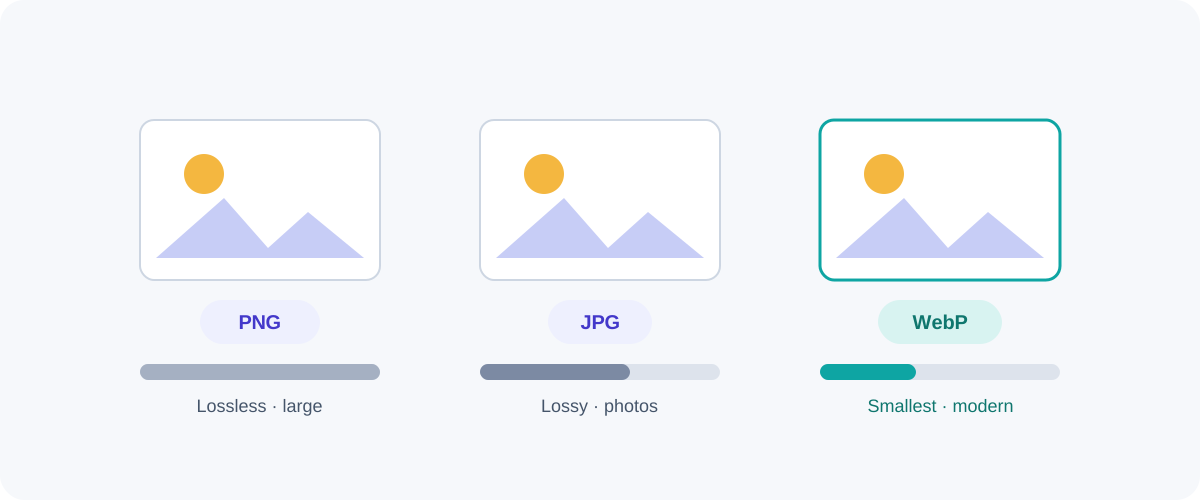
Image PNG vs JPG vs WebP: Which Image Format Should You Use?
A plain-English comparison of the three formats you meet every day — what each is good at, where each falls down, and a simple rule for always picking the right one.